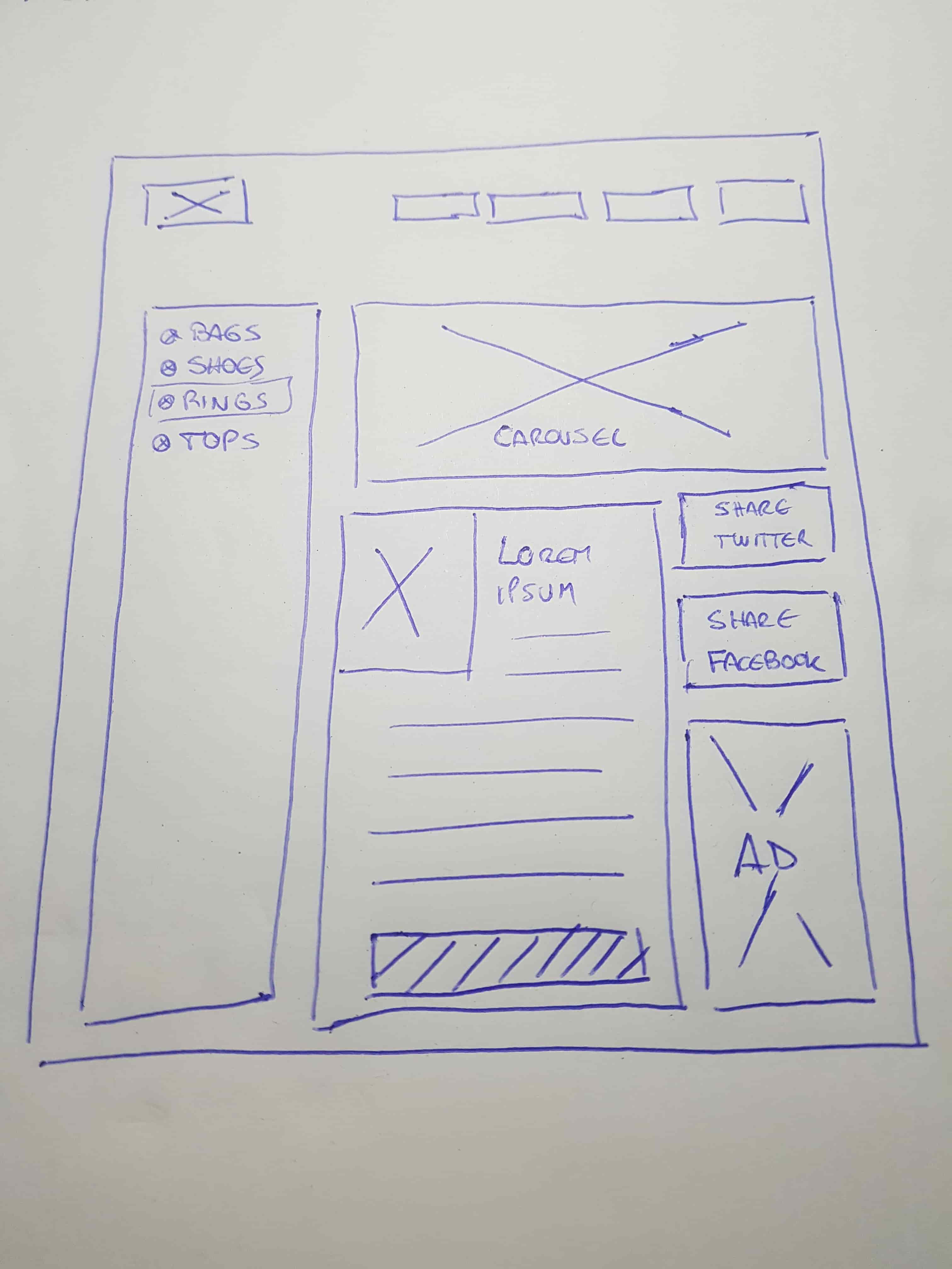
Wireframing if one of the first steps in your design process. It is the time when your ideas start to take shape.
This article will show different tips to help you creating better wireframes for your web and mobile experiences.
What is a Wireframe
A wireframe is a basic skeleton of your project. It does not use real user interface elements, instead, it uses placeholders. Wireframes tend to validate information architecture and general user flows.

Why is it important?
Wireframing is a critical step in the process of designing a product/website because it helps to determine how it is supposed to look and function. Wireframing ensures that everyone involved in the project remains on the same page with regards to a product’s structure and features. Wireframes can also serve as product documentation - a guide for ux designers who are building the project.
Best practices
Research
If you research before start creating wireframes, you will need what users need and what they want.
I recommend to think in 2 goals: Business goals and user goals. Both are essential to your product success.
Researching will help you set clear expectations of what you want to achieve.
Keep it simple
Wireframes shouldn't slow you down. One of the main advantages of wireframing are simplicity. You can change quickly if you receive feedback from others. You should be able to show more options without delay.
Keeping wireframes as simple as possible will help you to focus your ideas.
Do it collaboratively
The best part of wireframing is that you can create it collaboratively. Brainstorming is one of the most useful methods to increase the potential of the wireframes.
Showing wireframes with the team members and receive feedback is the best way to improve the quality of the deliverables.
Create easy to follow wireframes
Remember: Wireframing is about communication. Probably you should share your wireframes with other team members or stakeholders, so you need to tell a story and communicate your ideas clearly. If you only can understand the wireframe, probably you made a mistake.
Here is a list of tips you can follow to test your wireframes:
- Pilot testing: Try to show your wireframes to a person who is not involved in your project. You should do it without exception. Is the fastest way to get feedback.
- Add annotation in your wireframes to show key elements and explanation. You should not add lot of text, it is about provide description and context of your work.
Bad practices
Show all of your application parts
You should show the wireframes of all the sections of your app. If you say "The booking page is the same as your competitor", you will lose context, because your wireframe is missing important parts of your potential users. Nothing in your project can be ignored.
Do not start with digital tools
Sketch your ideas first, try and fail, and then move to your favourite digital tool. People tend to start using Axure or Balsamiq, but thinking without a paper is very different if you can erase and start again drawing.
Do not try to create good looking wireframes
Don’t focus too much on how your wireframes look. Remember that a wireframe is a tool which helps you understand information architecture of pages not visual or interaction design. When you focus too much on the later, you might have too polished wireframes but absolutely not solution-oriented. Visual and interaction design should be left to later stages of the product design process.
Do not use colors
Wireframes in grayscale prevents distractions by the color. The primary purpose of a wireframe is to lay out content and to describe the project's functionality. Adding in multiple colors can cause distractions. My recommendation to avoid using color in your wireframe. You only can use colors when you need to highlight some element of your interface.
